
Runway is an invitation-only, startup incubator that occupies 30,000 square feet of the Twitter building in San Francisco. It stands out to us for the way that it looks and, we’re told, feels much more like a community than a workspace. According to Eric Ibsen, Chief Design Officer at FME, his team looked to an “airport runway model of generous proportions” to inspire the center circulation zone. “Like an airport, there are opportunities for casual meetings which are both private and completely out in the open, by virtue of the extra elbow room,” he said.
We shot a few questions Ibsen’s way to learn more:
What is it about the space that you think makes it more communal than just any old incubator?
Unlike most co-working/accelerator/incubator spaces, there’s more physical room at Runway. In contrast to the high-density model of many concepts, the concept here is that some kinds of development benefit from a greater degree of contrast between heads-down work areas and places designed for alternate working/learning/social modes. [The contrast] between spaces makes each more successful. The center aisle gets a lot of use and the sheer expanse of space is very freeing. As a result, it seems to us that the community develops and thrives based on people choosing to convene, collaborate, and socialize, not simply running into each other based on density and proximity.
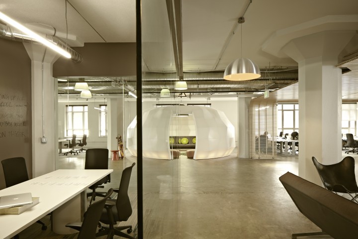
What’s your favorite part of the finished project?
Most folks seem to talk about the “Igloo” as their favorite part of the project. The space is expansive enough to accommodate this room within a room and the shape of it is particularly inviting. We understand that it’s difficult to get people out of there once they get inside. Lots of “camping out.” We also have a “Snake” at the opposite end of the space made of the same material, a Seeyond product.
What did FME do new and differently in this project compared to similar projects?
We held the center circulation zone as open space, patterning the dimension on an airport runway model of generous proportions. The natural bay spacing defines this zone but it took real effort to avoid the temptation to simply fill a portion of this space with more workstations. In doing this, the high-density bays to either side benefit from both the physical and psychological room afforded by this powerful unifying element. Like an airport, there are opportunities for casual meetings which are both private and completely out in the open, by virtue of the extra elbow room.

What do you think is particularly forward-thinking about this project and what do you think it says about the future of tech design, and more generally, workplace design?
Compared to other technology work we’ve done, the luxury of the center zone adds a measure of relief that’s not possible in a typical high-density environment. There’s a level of civility that contrasts with the constant bustle of a space with no extra room. We think that there will be a move back towards some traditional design strategies as we learn how a fully open environment impacts productivity, retention, and recruitment.
Did you use a particular material or product in a really cool way in the project?
Our favorite materials in this project are the slatted wood ceilings and the sculptural meeting areas (by Seeyond). The existing building is concrete and we exposed that throughout the project in floors, walls and ceilings. Both the ceiling and meeting enclosure elements lighten the design, one with the natural appeal of wood, the other through use of a new, unexpected material.
This interview has been edited and condensed.